5 Ways to Improve Your Blog Design

5 ways to Improve Your Blog Design

Your blog content may be spectacular, but if your blog design is lacking, then I’m not going to keep reading. I’ll be honest: ever since I started my graphic design major, I’ve gotten way snobbier about strong vs weak design. (Sorry ’bout it.) But you don’t have to have a degree in design to have a strong website! Here are five ways to improve your blog design for the better.

5 ways to Improve Your Blog Design

Make sure your text is readable.

I know writing in lowercase is cute, but it’s hard to read and your audience will click away from your website fast. Similarly, your text should be left-aligned. It makes your blog just look that much more professional. Along with that, your font needs to be pretty plain. That’ll make your design look a lot cleaner.

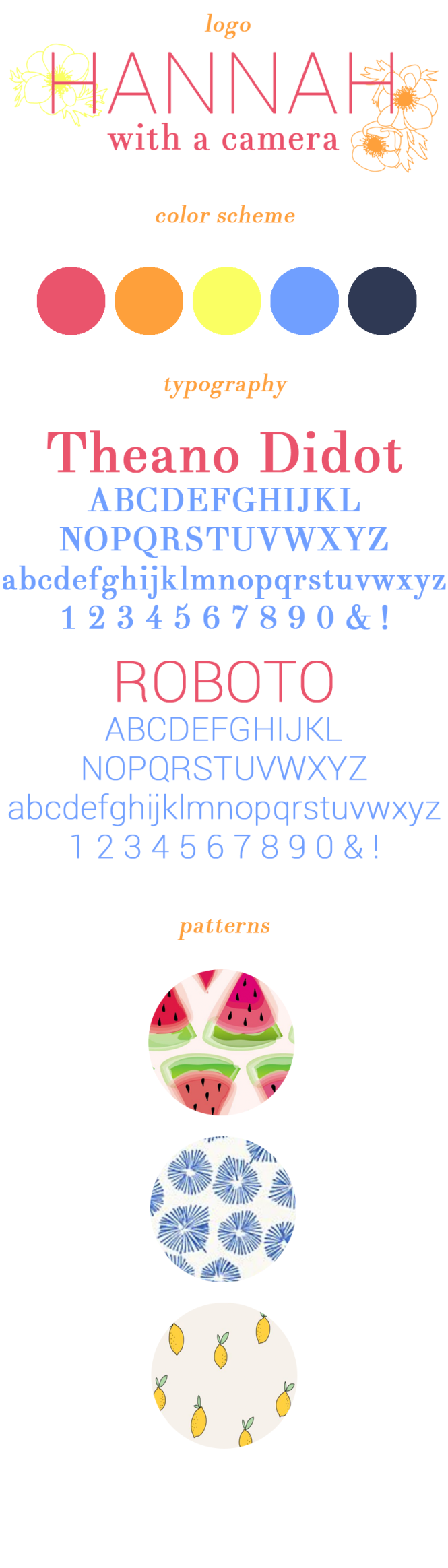
A cohesive color scheme is key.

It’s tempting to change color schemes based on what’s trendy or the seasons changing. However, it becomes something to keep up with when your blog design is constantly changing and your audience will get confused when they see a new website every time they click. I created a color palette in my branding graphic that I made for myself, and I use those colors all throughout my blog design, without fail.

Limit your categories.

Eight categories should be the maximum amount that you have on your blog. If I see too many categories on the sidebar, it’s incredibly overwhelming and probably not necessary. Categories are only meant to help direct your reader to related posts and help drive traffic to your blog.

Chill with the fonts.

Only select two-three fonts to focus on. You should have a serif font, a sans serif font and a decorative font. A serif font has the little ‘tails’ off the end of each letter and is good for big blocks of text. A sans serif font is good for standing out and for titles (though these can be alternated if done right). A decorative font is optional, but can be used for titles and emphasizing certain words in a graphic. Definitely don’t use a decorative font for text longer than five-ish words though!

Simplicity is stronger.

This is the number one rule of blog design! I can’t stand seeing a blog with a tiled picture in the background, distracting me from the writing immediately. Your content needs to be the main focus, so stick to a white background (or shades of white/cream). Make sure your logo doesn’t have an overwhelming amount of little images or text pieces as well.

These tips are simple but easy changes to make that can make your design look so much better!

xo, Hannah

Bonus- if you missed the first code for 20% off of my stickers with Redbubble, you can use the code draw-hannahcbettis through November 1st for 20% off!

Continue Reading

Day Designer Today & To Do Blue Sky Review

Today and To Do Day Designer Review

I’ve wanted a Day Designer for a while now, and when I saw that Blue Sky was releasing a daily version last year for Target I jumped on the opportunity. I absolutely loved having a to-do list built into my planner alongside my schedule. I had the large daily/monthly planner and while it definitely fit what I wanted, I ended up not using every single daily page and the coil started coming undone because I used it so much. Lucky for me, Blue Sky and Day Designer partnered up again to release more versions of their coveted planners!

daydesigner5
Day Designer Today & To Do Blue Sky Review

I purchased the Monthly/Today & To Do in the 8×10 jade. I wanted the navy small version originally, but my Target only had the jade in the larger size and I’m glad I went with this one. The binding makes it easy to lay flat and I won’t have to worry about the coil coming undone this time.

Day Designer Today & To Do Blue Sky Review

The planner starts with a monthly view from July 2016-June 2017. I love being able to see my whole month at a glance, and it’s really helpful that each box is big enough for me to write a lot for each class if I need to. Typically I’ll write out my color key on the left in the to-do and notes section using my Staedtler triplus fineliner pens (these don’t bleed through the pages). I’ll then write important events in the monthly pages. For school, I’ll usually just write out big assignments instead of every single one–that can get cluttered fast!

Day Designer Today & To Do Blue Sky Review

This is the weekly layout, with Monday-Wednesday on the left side and Thursday-Sunday on the right. My favorite part about the Today and To-Do is that it’s undated, so if I have a break from school or won’t have enough to write for the whole week, then I’ll just rely on the monthly view. The undated planner also makes it much smaller than the daily is!

Day Designer Today & To Do Blue Sky Review

The weekly view has enough space to write in your schedule for the day on the left side and write in your to-do list on the right side. There’s fifteen weekly pages included. When I’m in school, I’ll write out my assignments that are due that day in the left column and what I need to finish in the right column. The Today & To Do also comes with two striped ribbons to easily keep your place.

Day Designer Today & To Do Blue Sky Review

Here’s a look at the daily view! There’s 90 of these included. It runs from 6am-8pm (as if I get up that early…) and includes a small ‘tonight’ box to add in extra activities past that time. I love that it includes a box to write down what you’re grateful for each day. These pages also have a notes section to write down random things you need to remember throughout the day, but I’ve seen some people use this as a journaling section.

What planner are you using?

xo, Hannah

Continue Reading

Branding and Blog Design: Updated

Back when I started my blog, I had some design experience, but not much! I created my blog design a year ago in February with a modern and classic design in mind. Since then, I still love my design, but I feel like my personality has changed a bit and I have a bolder taste in colors. I took my old design and updated it a bit, in part after taking inspiration from my graphic design Pinterest board.

I first created a vision board by taking screenshots of a lot of my favorite graphic design pins and arranging them how I liked. After, I found a common theme of hand-drawn graphics, sharp photography, and bright colors.

Hannah With A Camera vision board images via Becca Clason, Peyton Perry, Sophie Ledesma, Lucia Litman

I definitely recommend creating a vision board or a board on Pinterest when you’re designing anything. It helps you find a common theme with the colors and photos that you usually gravitate towards. My design taste has changed a ton since I first created my blog, so I was due for a redesign.

Hannah With A Camera Blog Design Branding Board

The biggest difference that I think you can see with my old design and this new one is the color scheme. These colors are so vibrant and make everything bolder. I kept the typefaces the same, but I changed my patterns and my header to reflect the hand-drawn aesthetic.

What’s your favorite thing about the new design?

xo, Hannah

Continue Reading

All About the Instagram Algorithm

If you haven’t heard already, Instagram is changing its algorithm, and everyone is freaking out.

new algorithm.png


Here’s the deal with the algorithm (this only applies if you have the latest update). Instagram is taking a cue from Facebook and switching from the normal order of posts showing up in chronological order…to what they think is what you want to see.

You have two options to make the algorithm what you want. First, you can follow all the other blogger’s pleas to turn on post notifications.

Screenshot_2016-03-28-16-29-11.png


To do this, you just go to a profile (like @andrewknapp, one of my favorite photographers) and click on the top right corner with the three dots.

Screenshot_2016-03-28-16-29-17.png


Then all you have to do is tap that ‘turn on post notifications’ button, and you’ll get a notification every time that account posts a new photo.The perks to this is that you’ll never miss a post, except your battery will drain asap depending on how many people you turn on post notifications for. I personally wouldn’t recommend doing this for more than 5 people.

Screenshot_2016-03-28-17-24-03.png


The easy option is to just keep doing what you’re doing: comment every once in a while and like people’s pictures like normal. Instagram will curate your feed based on the photos that you engage with. If everyone follows this rule of thumb, then you won’t have a problem.

Want a more in depth post? Krista from Covering the Bases has all the details.

xo Hannah

Continue Reading

#LifeHackToBoredom with Nestlé® Crunch® Chocolate Truffles

While attempting to write this recipe, I realized something very important: my mom has way too many recipes in her head that I’ve never tried to make–and that aren’t written down. This marks the beginning of an attempt to compile all my family’s favorite eats into a place I’ll be able to find in the future (the internet). That being said, I’m not a professional anything, and I don’t claim to know all that’s going on with this recipe. If you have questions, ask, but this is the kind of recipe that requires “a pinch of this” or a “pinch of that.”

Nestlé® Crunch® chocolate truffles are the way to go! Read on for the recipe:

This has been in my family for a while and it’s a staple at family get-togethers. I’ve seen my mom make this treat several times, but this is the first time I’ve watched with the intent of learning the recipe for myself. However, this new recipe contains a fun twist to break up the boredom: a Nestlé® Crunch® topping. (P.S. Read all the way to the bottom to see a special giveaway!)

The best part about these truffles is that they’re easy to store and a treat that you can take on the go. I keep them in my dorm room mini-fridge right now and can pop a bite-sized piece in my mouth as a simple way to add a little joy to my mundane class routine. As a college student living a five-minute walk to my dining hall, I have to resist eating unhealthy foods all the time! But Nestlé® Crunch® is the perfect dessert for me, seeing as it’s made with real milk chocolate and no artificial colors or flavors. The mini bars are great to tuck in my backpack or even slip in a friend’s backpack as a small treat to make them smile.

There are several different ways you can break up the boredom in your life: by liking Nestlé® Crunch® on Facebook, posting a photo to Facebook, Twitter or Instagram with the hashtag #LifeHackToBoredom, or by making your own Nestlé® Crunch® truffles!

Start by crumbling the package of cookies in a food processor. Afterwards, combine with cream cheese and stir well.

Nestlé® Crunch® chocolate truffles are the way to go! Read on for the recipe:

Once you’ve chilled the mixture, form the mix into small balls and place on a cookie sheet lined with wax paper.

Nestlé® Crunch® chocolate truffles are the way to go! Read on for the recipe:

Start melting the chocolate using the double boiler method. While the chocolate melts, begin chopping up the Nestlé® Crunch® bars for your topping!

Nestlé® Crunch® chocolate truffles are the way to go! Read on for the recipe:

Nestlé® Crunch® chocolate truffles are the way to go! Read on for the recipe:

Once the chocolate is completely melted, begin dipping the balls into the chocolate. Make sure they’re completely covered.

Nestlé® Crunch® chocolate truffles are the way to go! Read on for the recipe:

Have a friend to help you put the topping on as quickly as possible before the chocolate sets.

Nestlé® Crunch® chocolate truffles are the way to go! Read on for the recipe:

Place the truffles back into the fridge to cool and harden. While you’re waiting, lick the spoon and have another Nestlé® Crunch® while you’re at it 🙂

Nestlé® Crunch® chocolate truffles are the way to go! Read on for the recipe:

Now you have the perfect on-the-go treat!

Nestlé® Crunch® chocolate truffles are the way to go! Read on for the recipe:

Ingredients: 
-one block (4oz) of cream cheese
-one package of chocolate wafer cookies
-one package (12oz) of semi-sweet chocolate chips
-5 mini Nestlé® Crunch® bars

Instructions:
1) Place the chocolate wafer cookies in a food processor until finely  crumbled.
2) Stir in one block of cream cheese and combine well.
3) Chill the mixture for about 45 minutes to an hour.
4) Form golf-ball sized balls from the mixture with your fingers, making sure the balls stick together. If the cream cheese was mixed in properly then it should work fine.
5) Start boiling water using the double-boiler method with two pots (water in the bottom, nothing on top)
6) Place balls on a cookie sheet lined with wax paper.
7) Place balls back in fridge while water heats up.
8) Once the water is boiling, pour the chocolate chips in the top pot. Watch carefully to make sure there is no burning.
9) After the chocolate is fully melted, use two spoons to hold a ball in between them, then dunk in the chocolate. Don’t worry about making them look perfect, it all tastes the same 🙂
10) After covering a ball with chocolate, apply the Nestlé® Crunch® topping. It works better to have two people doing this at once because the topping sticks better right after the chocolate is applied.
11) Let the balls set in the fridge.
12) Once set, enjoy! Store these in the fridge until ready to be eaten.

Below I’m giving away $20. You can use this to break up the monotony in your own life! Click the link below to enter.

a Rafflecopter giveaway

Continue Reading

Branding and Blog Design

I’ve only been an ‘official’ blogger for a few months, but I’ve learned the importance of branding already. A while ago I created an inspiration board for my blog on Pinterest, and from that I created this branding reference.

Branding inspiration for Hannah With a Camera.

The inspiration for my color scheme came straight from my room. Turquoise, coral, navy and grey are all throughout my room, from the light turquoise walls to the coral accents. A peek into my closet proves my love for these bright colors!

I wanted both a modern and a classic feel, and the fonts reflect this. Theano Didot is a classic font inspired by Vogue magazine’s bold lettering. Anyone with some knowledge of graphic design knows that serifs are best mixed with san serifs, so I picked Roboto Thin. These two fonts are great free fonts for any design.

The patterns I chose help influence the classic feel of my blog. Stripes and polka dots will always be in style. The gold, in my opinion, adds a stylish touch.

Keep an eye out for my next post with tips on creating a brand board for yourself!

Thanks for reading,

navy monogram

Continue Reading